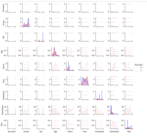
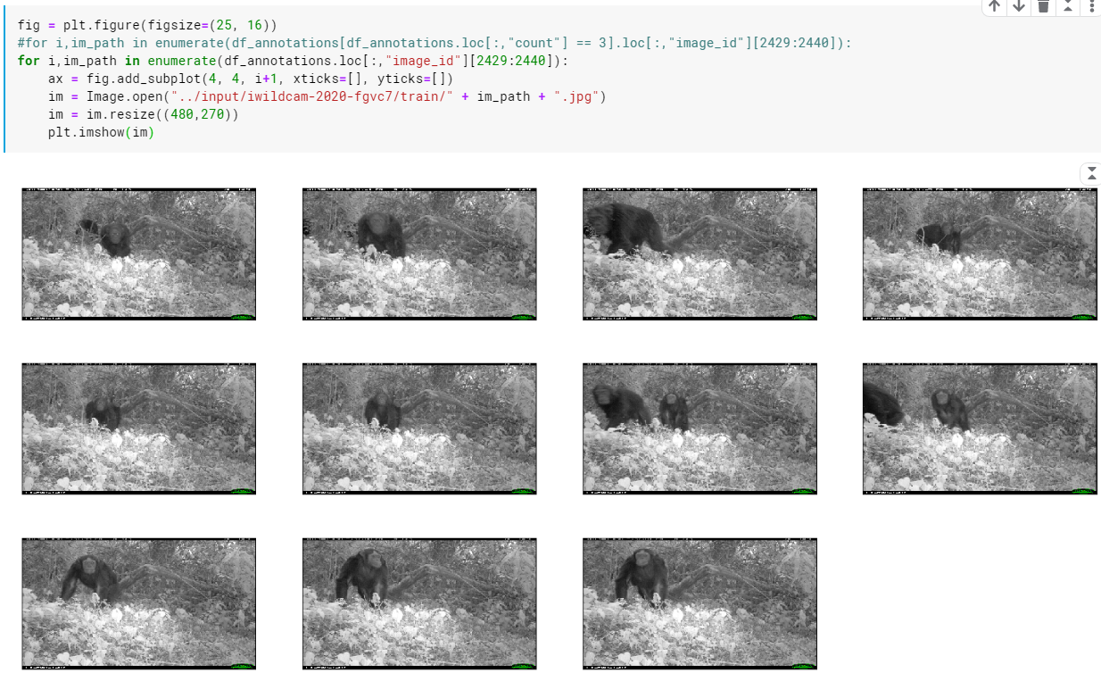
複数の画像を並べて表示
fig = plt.figure(figsize=(25, 16))
#for i,im_path in enumerate(df_annotations[df_annotations.loc[:,”count”] == 3].loc[:,”image_id”][2429:2440]):
for i,im_path in enumerate(df_annotations.loc[:,”image_id”][2429:2440]):
ax = fig.add_subplot(4, 4, i+1, xticks=[], yticks=[])
im = Image.open(“../input/iwildcam-2020-fgvc7/train/” + im_path + “.jpg”)
im = im.resize((480,270))
plt.imshow(im)
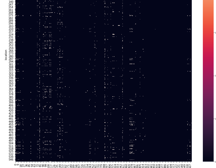
sns.heatmap:ヒートマップ
fig = plt.figure(figsize=(15, 15))
ax = sns.heatmap(loc_cat_matrix)
ax.set(xlabel=’category’, ylabel=’location’)
plt.title(‘Relation between animal categories and locations’)
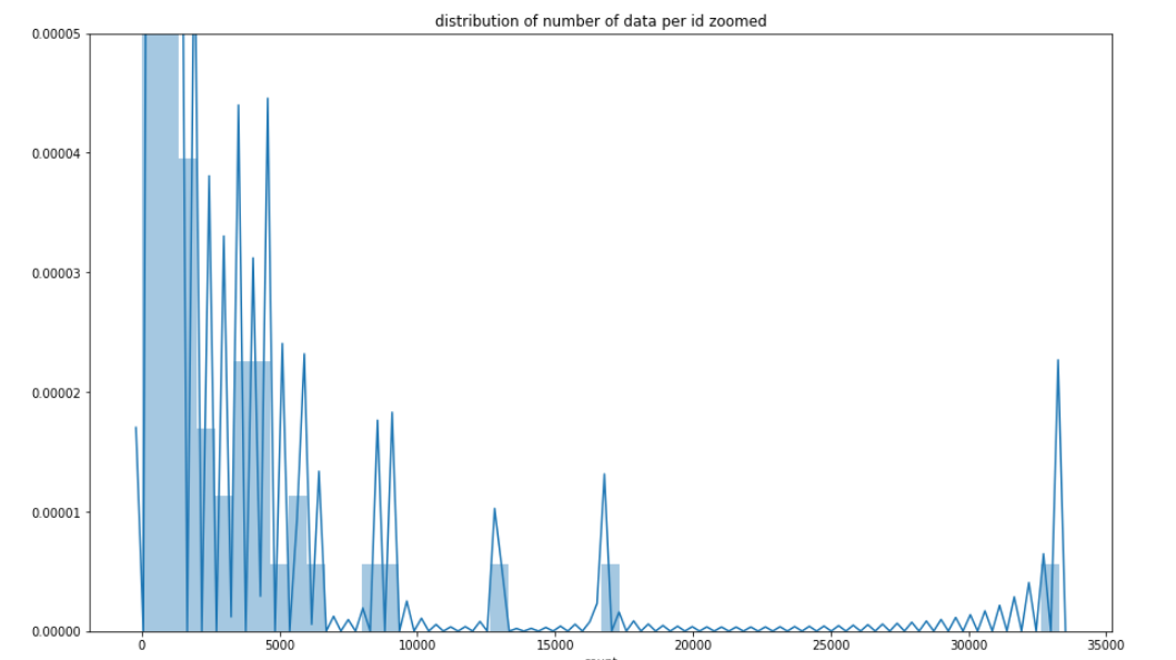
ヒストグラム(棒グラフ)
sns.distplot:データの分布を視覚化する
fig = plt.figure(figsize=(15, 9))
ax = sns.distplot(df_categories[‘count’][1:])
ax.set(ylim=(0,0.00005))
ax.set(xlabel=’count’)
plt.title(‘distribution of number of data per id zoomed’)
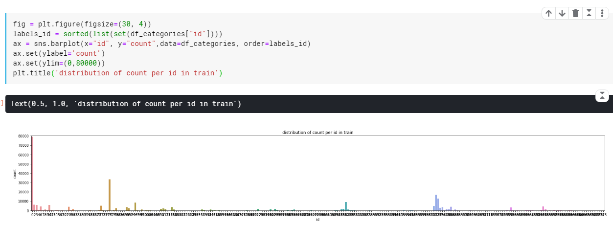
Barplot: データの平均値と信頼区間を出力
fig = plt.figure(figsize=(30, 4))
labels_id = sorted(list(set(df_categories[“id”])))
ax = sns.barplot(x=”id”, y=”count”,data=df_categories, order=labels_id)
ax.set(ylabel=’count’)
ax.set(ylim=(0,80000))
plt.title(‘distribution of count per id in train’)
Countplot: データの件数 (頻度) を集計
データの件数を集計し、ヒストグラムとして出力
fig, ax = plt.subplots(1,2, figsize=(30,7))
# 左側
ax = plt.subplot(1,2,1)
ax = plt.title(‘Count of train data per month & year’)
ax = sns.countplot(month_year, order=labels_month_year) #累計
ax.set(xlabel=’YY-mm’, ylabel=’count’)
ax.set(ylim=(0,50000))# 右側
ax = plt.subplot(1,2,2)
ax = plt.title(‘Count of test data per month & year’)
ax = sns.countplot(month_year_test, order=labels_month_year)
ax.set(xlabel=’YY-mm’, ylabel=’count’)
ax.set(ylim=(0,50000))

相関係数行列
colormap = plt.cm.RdBu
plt.figure(figsize=(14,12))
plt.title(‘Pearson Correlation of Features’, y=1.05, size=15)
sns.heatmap(train.astype(float).corr(),linewidths=0.1,vmax=1.0,
square=True, cmap=colormap, linecolor=’white’, annot=True)

ペアプロット
g = sns.pairplot(train[[u'Survived', u'Pclass', u'Sex', u'Age', u'Parch', u'Fare', u'Embarked',
       u'FamilySize', u'Title']], hue='Survived', palette = 'seismic',size=1.2,diag_kind = 'kde',diag_kws=dict(shade=True),plot_kws=dict(s=10) )
g.set(xticklabels=[])